Learn how to use white space effectively in your presentations. Tips for PowerPoint, Google Slides, and Keynote to create clean, professional, and engaging slides.
Blog Post (≈800 words):
White space, also known as negative space, is often underestimated in presentation design. It’s the empty space around text, images, and graphics, but it plays a crucial role in enhancing readability, focus, and visual appeal.
At FastTrackTemplates.com, we design PowerPoint, Google Slides, and Keynote templates that use white space strategically to make slides look clean, professional, and engaging.
Here’s how to use white space effectively in your presentations.
1. Understand the Value of White Space
White space isn’t wasted space — it’s a design tool:
-
Improves readability and comprehension
-
Creates a professional and modern appearance
-
Focuses attention on key content
Our templates incorporate ample white space, balancing text, visuals, and graphics perfectly.
2. Avoid Overcrowding Slides
Too much content crammed onto one slide overwhelms your audience:
-
Limit text to 5–6 bullet points per slide
-
Avoid cluttered charts or multiple images
-
Break complex ideas into multiple slides
Templates from FastTrackTemplates are designed for minimalism and clarity, making slides easier to read and retain.
3. Use Margins and Padding
Proper spacing around elements ensures clarity:
-
Leave margins around text blocks and images
-
Ensure spacing between bullets and paragraphs
-
Use padding around visuals to prevent clutter
Our templates are pre-formatted with optimal margins and padding for balance and readability.
4. Highlight Key Elements
White space helps emphasize important content:
-
Surround headlines or call-to-action text with empty space
-
Isolate charts or infographics for focus
-
Use white space to guide the audience’s eye
Templates include highlight layouts where white space naturally draws attention to main points.
5. Pair White Space With Typography
White space and fonts work together for readability:
-
Use clear, legible fonts
-
Allow space between lines (line-height)
-
Avoid small fonts crammed into tight spaces
FastTrackTemplates combine professional fonts with generous white space, ensuring text is easy to read on any screen.
6. Balance Visuals and Text
White space balances the relationship between visuals and text:
-
Avoid placing images too close to text
-
Leave breathing room around charts and icons
-
Ensure the slide doesn’t feel overcrowded
Templates provide balanced layouts where visuals and text complement each other with enough white space.
7. Create Rhythm and Flow
White space helps structure content logically:
-
Use consistent spacing between sections
-
Guide viewers from one point to the next
-
Maintain visual rhythm across multiple slides
Templates are designed with structured white space, creating smooth transitions and flow.
8. Embrace Minimalism
Minimalist slides naturally rely on white space:
-
Focus on one idea per slide
-
Remove unnecessary design elements
-
Let your content and visuals stand out
FastTrackTemplates offer minimalist templates that leverage white space for a clean, professional look.
9. Avoid Overfilling With Background Patterns
Busy backgrounds reduce the effect of white space:
-
Stick to solid or subtle gradient backgrounds
-
Avoid patterns or textures that clutter the slide
-
Keep backgrounds consistent across slides
Templates are built with clean, distraction-free backgrounds, maximizing the impact of white space.
10. Test Across Devices
White space may appear differently on projectors, monitors, or mobile devices:
-
Check readability on multiple screens
-
Ensure spacing around text and visuals remains consistent
-
Adjust margins or padding if needed
All FastTrackTemplates are optimized for multi-device viewing, maintaining white space effectiveness everywhere.
Final Thoughts
White space is a powerful design element that enhances clarity, focus, and professionalism. By strategically using space around text, images, and graphics, your slides become cleaner, more readable, and visually appealing.
At FastTrackTemplates.com, our PowerPoint, Google Slides, and Keynote templates are designed with white space in mind, making it easy to create presentations that look polished and engage your audience effortlessly.
✨ Explore our templates today and harness the power of white space to transform your slides into clean, professional, and memorable presentations.


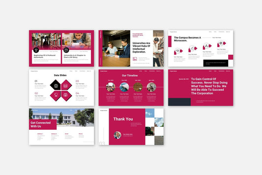
![Customer Profile Slides PowerPoint Template [20 Unique Slides]](http://fasttracktemplates.com/cdn/shop/files/customer-profile-slides-powerpoint-template_307177-original_1_533x.jpg?v=1760546057)


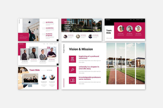
![Perfect Business PowerPoint Presentation template PowerPoint Template [6750+ Total Slides]](http://fasttracktemplates.com/cdn/shop/files/perfect-business-powerpoint-presentation-template_122226-2-original_533x.jpg?v=1760620720)
![Perfect Business PowerPoint Presentation template PowerPoint Template [6750+ Total Slides]](http://fasttracktemplates.com/cdn/shop/files/28c70a5efd92c9584c5070151da249cb_533x.jpg?v=1760620720)

