

![Customer Profile Slides PowerPoint Template [20 Unique Slides]](http://fasttracktemplates.com/cdn/shop/files/customer-profile-slides-powerpoint-template_307177-original_1_533x.jpg?v=1760546057)
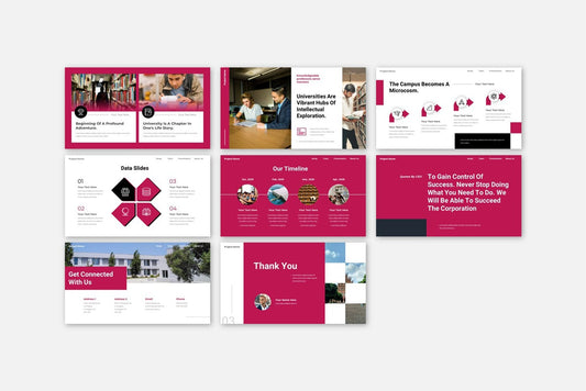
![Perfect Business PowerPoint Presentation template PowerPoint Template [6750+ Total Slides]](http://fasttracktemplates.com/cdn/shop/files/perfect-business-powerpoint-presentation-template_122226-2-original_533x.jpg?v=1760620720)
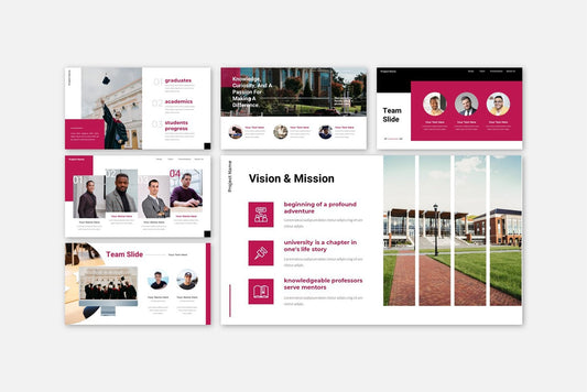
![Perfect Business PowerPoint Presentation template PowerPoint Template [6750+ Total Slides]](http://fasttracktemplates.com/cdn/shop/files/28c70a5efd92c9584c5070151da249cb_533x.jpg?v=1760620720)

Learn how to use color psychology to make your presentations more engaging and persuasive. Explore PowerPoint, Google Slides, and Keynote templates designed for maximum impact.
Blog Post (≈800 words):
Color is one of the most powerful tools in presentation design. It can evoke emotions, guide attention, and even influence decision-making. Understanding color psychology helps you create slides that not only look professional but also communicate your message more effectively.
At FastTrackTemplates.com, we design PowerPoint, Google Slides, and Keynote templates with color psychology in mind — ensuring your presentations are visually compelling and strategically effective.
Here’s how to leverage color psychology in your next presentation.
1. Understand the Basics of Color Psychology
Colors evoke emotions and perceptions. Some common associations include:
-
Red: Energy, urgency, excitement
-
Blue: Trust, professionalism, calm
-
Green: Growth, health, balance
-
Yellow: Optimism, creativity, attention
-
Orange: Enthusiasm, innovation, friendliness
-
Purple: Luxury, sophistication, imagination
-
Gray/Black: Neutrality, elegance, seriousness
Knowing these associations helps you choose colors that reinforce your message and resonate with your audience.
2. Choose a Primary Color that Aligns with Your Goal
Your primary color should reflect your presentation’s purpose:
-
Business pitch → Blue or gray for professionalism
-
Marketing campaign → Orange or red for energy and engagement
-
Education or training → Green or blue for calm and focus
-
Creative presentation → Purple or yellow for innovation and creativity
FastTrackTemplates offer pre-selected color palettes optimized for different purposes, making it easy to choose the right mood.
3. Use Accent Colors Strategically
Accent colors draw attention to key points, calls to action, and important visuals:
-
Highlight numbers, quotes, or statistics
-
Use a contrasting color for buttons and icons
-
Limit accents to 1–2 per slide to avoid distraction
Our templates feature cohesive accent color schemes, helping your slides stay visually balanced.
4. Maintain Color Consistency
Consistency is crucial for a professional appearance:
-
Stick to 2–3 main colors across your deck
-
Use the same shades for headings, charts, and icons
-
Avoid adding random colors that disrupt harmony
FastTrackTemplates are designed with pre-set color schemes, ensuring a cohesive, polished look.
5. Consider Background and Contrast
Your background color impacts readability:
-
Light text on a dark background can be dramatic but must be legible
-
Dark text on a light background is classic and easy on the eyes
-
Ensure enough contrast between text, icons, and shapes
All FastTrackTemplates use high-contrast, readable color combinations optimized for presentations on any screen.
6. Use Color to Guide Attention
Color naturally draws the eye. You can use it to:
-
Emphasize headings or main points
-
Separate sections or categories
-
Highlight trends in graphs or charts
Templates from FastTrackTemplates include charts and infographics designed with color emphasis, making key information stand out.
7. Leverage Color for Branding
When presenting on behalf of a company or brand, align colors with your brand identity:
-
Use your official brand palette for titles, icons, and charts
-
Ensure visuals reflect the brand’s tone (professional, creative, fun)
-
Templates are easy to customize to your brand colors
This enhances professionalism and reinforces recognition.
8. Avoid Overloading with Color
Too many colors can overwhelm and confuse your audience:
-
Stick to a maximum of 4–5 colors per slide
-
Use neutrals like gray or white to balance bold colors
-
Keep charts and graphs visually clean
FastTrackTemplates are carefully designed to balance color and whitespace, reducing clutter.
9. Use Color to Evoke Emotion
Color can influence how your audience feels and reacts:
-
Red or orange → Excitement and urgency
-
Blue or green → Calmness and trust
-
Purple → Creativity and luxury
Think about your presentation’s emotional goal, and choose colors that reinforce that message.
10. Test Your Colors Across Devices
Colors may appear differently on monitors, projectors, or mobile devices:
-
Test your slides on multiple devices
-
Ensure readability and vibrancy remain intact
-
Adjust if any colors appear washed out or hard to read
All FastTrackTemplates are optimized for multiple devices, ensuring your color choices remain effective anywhere.
Final Thoughts
Color is more than decoration — it’s a communication tool. By understanding color psychology and using it strategically, you can create presentations that capture attention, convey emotion, and leave a lasting impact.
At FastTrackTemplates.com, we offer PowerPoint, Google Slides, and Keynote templates designed with expert color palettes and visual harmony.
🎨 Explore our collection today and start designing presentations that look great, feel professional, and communicate effectively.
