

![Customer Profile Slides PowerPoint Template [20 Unique Slides]](http://fasttracktemplates.com/cdn/shop/files/customer-profile-slides-powerpoint-template_307177-original_1_533x.jpg?v=1760546057)
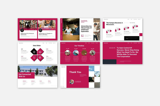
![Perfect Business PowerPoint Presentation template PowerPoint Template [6750+ Total Slides]](http://fasttracktemplates.com/cdn/shop/files/perfect-business-powerpoint-presentation-template_122226-2-original_533x.jpg?v=1760620720)
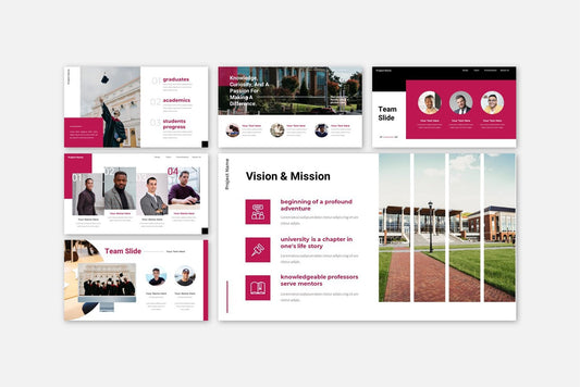
![Perfect Business PowerPoint Presentation template PowerPoint Template [6750+ Total Slides]](http://fasttracktemplates.com/cdn/shop/files/28c70a5efd92c9584c5070151da249cb_533x.jpg?v=1760620720)

Turn complex data into captivating visuals. Learn how to use infographics in PowerPoint, Google Slides, and Keynote to make your presentations clear, memorable, and visually stunning.
Blog Post (≈800 words):
In today’s fast-paced digital world, audiences don’t have time — or patience — for walls of text.
They want information that’s quick to understand, easy to remember, and visually appealing.
That’s why infographics have become one of the most powerful tools in presentation design.
They help transform raw data into visuals that tell a story.
At FastTrackTemplates.com, we specialize in PowerPoint, Google Slides, and Keynote templates packed with customizable infographic designs — so you can communicate insights effectively without needing a graphic design degree.
Here’s how to use infographics to make your presentations truly engaging.
1. What Are Infographics (and Why They Work)
An infographic combines text, images, icons, and charts to communicate information visually.
They simplify complex concepts, highlight relationships, and make data easier to digest.
Studies show that people remember 80% of what they see, compared to only 20% of what they read.
Infographics take advantage of this — helping audiences absorb information faster and retain it longer.
💡 In short: Infographics turn your presentation from “data-heavy” to “data-smart.”
2. Types of Infographics You Can Use in Presentations
Different data types call for different infographic designs. Here are the most popular ones:
-
Statistical Infographics: Best for surveys, reports, or numerical data.
-
Timeline Infographics: Great for showing company history, project milestones, or processes.
-
Process Infographics: Perfect for step-by-step guides or workflows.
-
Comparison Infographics: Use these to compare products, plans, or results side by side.
-
Hierarchical Infographics: Ideal for explaining structures like teams, organizations, or systems.
-
Geographic Infographics: Use maps to show regional or global data distribution.
At FastTrackTemplates.com, you’ll find templates featuring all of these infographic types — ready to edit, customize, and present.
3. Keep It Simple and Focused
The secret to a great infographic is simplicity.
Each infographic should convey one main idea. Too much text or data can confuse your audience.
Follow these tips:
-
Limit each infographic to 3–5 key points.
-
Use short, clear labels.
-
Avoid clutter — leave white space to help elements breathe.
Less is more when it comes to visual storytelling.
4. Use Color Strategically
Colors help guide attention and set mood.
For example:
-
Use contrasting colors to highlight important numbers.
-
Keep brand colors consistent across all infographics.
-
Use neutral backgrounds (white, light gray) to make charts and icons stand out.
Our templates are designed with color psychology in mind — so your visuals are both attractive and effective.
5. Choose the Right Icons and Visual Elements
Icons help audiences recognize patterns quickly.
Instead of long explanations, a simple icon can instantly communicate meaning — like a globe for “global reach” or a graph for “growth.”
FastTrackTemplates includes hundreds of editable icons you can recolor, resize, or swap with one click in PowerPoint or Google Slides.
6. Tell a Story with Your Data
Infographics aren’t just decoration — they should move your audience through a story.
Try this 3-step storytelling formula:
-
Setup: Present the problem or question.
-
Insight: Use data or visuals to explain your findings.
-
Action: End with a takeaway or recommendation.
For example, a marketing report might start with “Customer engagement is falling,” show “Data on declining metrics,” and conclude with “Proposed strategies for improvement.”
7. Make It Interactive (When Possible)
In 2025, interactive presentations are trending.
Add animations, clickable icons, or transitions to reveal data step by step — keeping your audience engaged.
Our templates include animated infographic slides, allowing you to control the flow of information during your talk.
8. Ensure Readability on All Screens
Remember that your presentation might be viewed on laptops, projectors, or phones.
That means your infographics should be readable at different sizes.
Use:
-
Large, clear fonts
-
High-contrast text
-
Simple charts with big data points
FastTrackTemplates’ layouts are optimized for clarity across devices — no blurry text or overcrowded visuals.
9. Customize Infographics for Your Brand
Infographics are a reflection of your identity.
Customize them with:
-
Your brand colors
-
Your company logo
-
Your typography style
All our templates are 100% editable — allowing you to create on-brand visuals in minutes.
10. Use Templates to Save Time and Boost Impact
Designing an infographic from scratch can take hours — or days.
Using a professional template lets you skip the design work and focus on your content.
At FastTrackTemplates.com, our infographic presentation templates include:
-
Dozens of infographic slide styles (timelines, charts, comparisons, maps)
-
Easy color and text customization
-
Compatibility with PowerPoint, Google Slides, and Keynote
-
Modern, data-driven layouts
You get world-class design — instantly.
Final Thoughts
Infographics are one of the best ways to simplify data, increase engagement, and make your message unforgettable.
By combining storytelling with visual clarity, you can turn any presentation into a memorable experience.
At FastTrackTemplates.com, we make it effortless.
Our professionally designed infographic templates help you present like a pro — no design skills required.
📊 Explore our collection today and turn your next presentation into a visual story your audience won’t forget.
