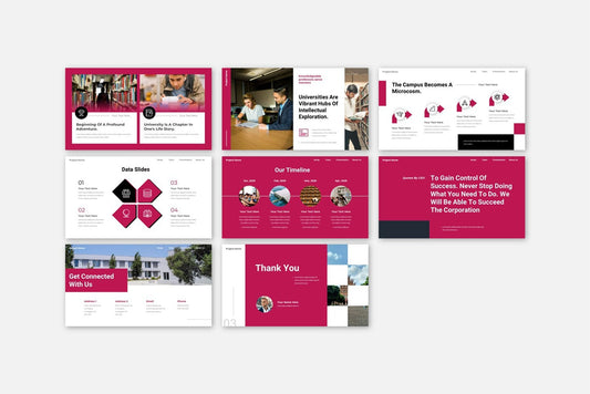
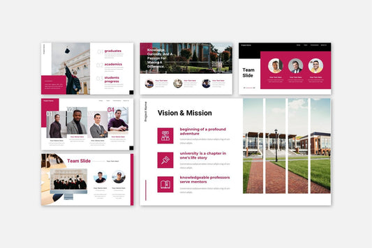
Discover which fonts make your presentations more readable and professional. Learn tips for PowerPoint, Google Slides, and Keynote to create impactful slides.
Blog Post (≈800 words):
Choosing the right font is one of the most important decisions when designing a presentation. Fonts affect readability, tone, and professionalism, and the wrong choice can make even the best content hard to follow.
At FastTrackTemplates.com, we design PowerPoint, Google Slides, and Keynote templates with fonts carefully selected for maximum impact and readability.
Here’s how to choose the best fonts for your presentations.
1. Prioritize Readability
Your audience should be able to read every slide at a glance.
✅ Tips:
-
Use sans-serif fonts for body text (e.g., Arial, Lato, Roboto)
-
Avoid overly decorative or script fonts for main content
-
Ensure font size is large enough for all screens (18–24pt minimum for body, 24–36pt for headings)
FastTrackTemplates are pre-designed with legible, screen-friendly fonts for every slide.
2. Use a Maximum of Two Fonts
Too many fonts create visual clutter.
-
One font for headings
-
One font for body text
-
Optional accent font for quotes or highlights
Our templates maintain typography consistency, ensuring slides are professional and easy to follow.
3. Match Fonts to Your Presentation Tone
Fonts convey personality:
-
Professional & corporate: Helvetica, Calibri, Arial
-
Creative & modern: Montserrat, Lato, Raleway
-
Education & training: Open Sans, Roboto, Source Sans Pro
-
Formal & elegant: Georgia, Merriweather
Templates from FastTrackTemplates come with industry-appropriate font pairings, saving time and ensuring consistency.
4. Consider Weight and Hierarchy
Using different font weights helps organize information:
-
Bold headings for key points
-
Regular or light font for body text
-
Italics for emphasis or quotes
Pre-set font hierarchies in templates ensure slides are easy to read and visually appealing.
5. Optimize Contrast for Readability
No matter how beautiful your font, poor contrast reduces impact:
-
Dark text on a light background or light text on a dark background
-
Highlight important words using color, bold, or size changes
-
Avoid busy backgrounds behind text
FastTrackTemplates include high-contrast designs, making text stand out clearly.
6. Avoid Overly Decorative Fonts
Fancy fonts may look attractive but can distract or reduce readability:
-
Use decorative fonts sparingly, for titles or accents only
-
Avoid script fonts for body text
-
Test your font on both large screens and mobile devices
Templates are pre-tested for readability across devices, ensuring your slides are legible everywhere.
7. Use Font Pairing Wisely
Pairing fonts can add visual interest without clutter:
-
Combine a serif font for headings with a sans-serif for body text
-
Use complementary styles that balance each other
-
Avoid pairing similar fonts that look redundant
FastTrackTemplates include carefully selected font pairs for professional slide design.
8. Maintain Consistency Across Slides
Changing fonts mid-presentation looks unprofessional:
-
Stick to the chosen font combination
-
Use consistent font sizes for headings, subheadings, and body
-
Align text uniformly across all slides
Templates from FastTrackTemplates maintain consistent typography, saving time and maintaining professionalism.
9. Test Your Fonts Across Devices
Some fonts render differently depending on the platform:
-
PowerPoint, Google Slides, and Keynote may display fonts differently
-
Check how slides look on laptops, tablets, and projectors
-
Substitute missing fonts with similar, available ones
All templates from FastTrackTemplates are cross-platform compatible for seamless presentation.
10. Use Fonts to Enhance Your Message
Fonts should support, not overpower, your content:
-
Bold fonts for emphasis
-
Clean, modern fonts for clarity
-
Subtle contrasts to guide audience focus
With the right fonts, your message becomes clearer, more engaging, and easier to remember.
Final Thoughts
Fonts play a crucial role in making your presentation professional, readable, and impactful. By choosing legible, consistent, and tone-appropriate fonts, your slides will engage your audience and convey your message effectively.
At FastTrackTemplates.com, our PowerPoint, Google Slides, and Keynote templates include fonts carefully selected for maximum readability and design impact, saving you time and ensuring polished results.
🎨 Explore our template collection today and start creating presentations that look professional and leave a lasting impression.


![Customer Profile Slides PowerPoint Template [20 Unique Slides]](http://fasttracktemplates.com/cdn/shop/files/customer-profile-slides-powerpoint-template_307177-original_1_533x.jpg?v=1760546057)


![Perfect Business PowerPoint Presentation template PowerPoint Template [6750+ Total Slides]](http://fasttracktemplates.com/cdn/shop/files/perfect-business-powerpoint-presentation-template_122226-2-original_533x.jpg?v=1760620720)
![Perfect Business PowerPoint Presentation template PowerPoint Template [6750+ Total Slides]](http://fasttracktemplates.com/cdn/shop/files/28c70a5efd92c9584c5070151da249cb_533x.jpg?v=1760620720)

