

![Customer Profile Slides PowerPoint Template [20 Unique Slides]](http://fasttracktemplates.com/cdn/shop/files/customer-profile-slides-powerpoint-template_307177-original_1_533x.jpg?v=1760546057)
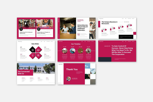
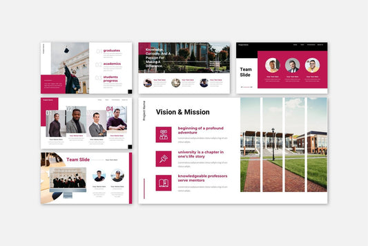
![Perfect Business PowerPoint Presentation template PowerPoint Template [6750+ Total Slides]](http://fasttracktemplates.com/cdn/shop/files/perfect-business-powerpoint-presentation-template_122226-2-original_533x.jpg?v=1760620720)
![Perfect Business PowerPoint Presentation template PowerPoint Template [6750+ Total Slides]](http://fasttracktemplates.com/cdn/shop/files/28c70a5efd92c9584c5070151da249cb_533x.jpg?v=1760620720)

Discover how colors influence emotion, attention, and decision-making in presentations. Learn how to use color psychology to design powerful PowerPoint, Google Slides, and Keynote templates.
Blog Post (≈800 words):
Color is more than just decoration — it’s communication.
In presentations, color sets the tone, influences mood, and even shapes audience perception. Whether you’re pitching a business idea or teaching a concept, your color choices can determine whether your message feels trustworthy, exciting, or professional.
At FastTrackTemplates.com, every PowerPoint, Google Slides, and Keynote template is built with color psychology in mind — helping presenters connect emotionally and visually with their audience.
Let’s explore how color psychology works — and how you can apply it to make your presentations more powerful.
1. What Is Color Psychology?
Color psychology is the study of how colors affect emotions and behavior.
Different colors evoke different feelings — and those feelings influence how your audience reacts to your message.
For example:
-
Blue can inspire trust and calm.
-
Red creates excitement and urgency.
-
Green represents growth and stability.
-
Yellow radiates optimism and energy.
When used strategically, colors can enhance comprehension, boost retention, and increase engagement.
2. Why Color Matters in Presentation Design
Color does more than make slides look appealing. It:
-
Grabs attention: Strategic color contrast highlights key points.
-
Organizes content: Different colors can visually separate topics or categories.
-
Reinforces brand identity: Consistent color schemes make your presentation recognizable.
-
Influences emotion: Warm colors energize; cool colors calm.
In short, color can guide your audience’s emotions and focus — if used wisely.
3. The Meaning of Common Colors in Presentations
Here’s what the most common colors say to your audience:
Blue – Trust, Calm, Professionalism
Blue is the most popular presentation color because it creates a sense of reliability and calm. It’s ideal for business, corporate, or technology presentations.
💡 Use it for: Financial reports, tech demos, company overviews.
Red – Energy, Passion, Urgency
Red grabs attention and stimulates action. It’s bold and emotional, perfect for highlighting key ideas — but use it sparingly.
💡 Use it for: Marketing pitches, product launches, motivational talks.
Green – Growth, Nature, Stability
Green is associated with health, sustainability, and prosperity. It’s easy on the eyes and conveys balance.
💡 Use it for: Environmental topics, business growth decks, or wellness presentations.
Yellow – Optimism, Warmth, Creativity
Yellow sparks curiosity and happiness, but too much can overwhelm. Combine it with neutral tones for best results.
💡 Use it for: Education, innovation, and creative industries.
Orange – Enthusiasm, Confidence, Fun
Orange blends the energy of red with the warmth of yellow. It’s playful and modern, great for startups and energetic teams.
💡 Use it for: Marketing, youth-oriented, or creative brand pitches.
Purple – Luxury, Creativity, Imagination
Purple signifies ambition and sophistication. It adds a premium feel to any design.
💡 Use it for: Fashion, design, or luxury presentations.
Black – Power, Elegance, Authority
Black is sleek and timeless. It creates strong contrast and visual drama when paired with bright accents.
💡 Use it for: Corporate, luxury, or minimalist slides.
White – Clarity, Simplicity, Openness
White keeps your slides clean and readable. It’s ideal as a background for colorful visuals or typography.
💡 Use it for: Modern, minimal, or educational presentations.
4. How to Choose the Right Color Palette
Follow these tips to create harmony and impact with your colors:
✅ Start with Your Brand Colors
If you’re representing a business or school, use your existing brand colors for consistency and recognition.
✅ Use Contrast for Readability
Make sure text stands out from the background. Dark text on light backgrounds (or vice versa) ensures clarity.
✅ Limit to 3–4 Core Colors
Too many colors cause distraction. Stick to a primary, secondary, and accent color for balance.
✅ Leverage Color Hierarchy
Use bold colors for headlines or calls to action and softer tones for supporting content.
✅ Test on Different Screens
Colors may appear differently on monitors, projectors, and mobile devices. Always test your palette before presenting.
5. How Templates Simplify Color Design
Designing the perfect color scheme can be time-consuming — but using a professional template makes it effortless.
At FastTrackTemplates.com, our templates come with:
-
Pre-built color palettes designed using proven psychological principles
-
Editable themes, so you can apply your brand’s colors in one click
-
Balanced contrast, ensuring readability on every slide
-
Versions for PowerPoint, Google Slides, and Keynote for flexibility across platforms
No need to be a designer — just plug in your content and present with confidence.
6. Bonus Tip: Match Color to Message
Your color scheme should support your story:
-
Presenting financial stability? Use blue or green.
-
Announcing a bold new idea? Add red or orange.
-
Teaching or motivating? Try yellow and white for clarity and warmth.
When color and message align, your slides feel cohesive and emotionally persuasive.
Final Thoughts
Color isn’t just about aesthetics — it’s a communication tool that shapes perception and emotion. By understanding color psychology, you can design presentations that resonate, persuade, and inspire.
At FastTrackTemplates.com, our PowerPoint, Google Slides, and Keynote templates are built with color strategy in mind — helping you design faster while making a lasting impression.
🎨 Explore our library today and discover how the right colors can turn your next presentation into a visual masterpiece.
